Circle progress chart
It is a visual that fills the place because it can be replaced with a 100% bar chart. On the other hand, it can create a w-o-w effect.

Let's help each other grow faster
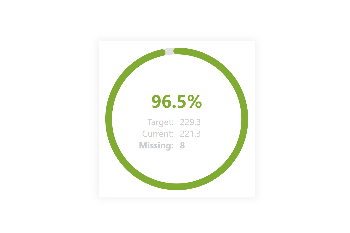
It is a visual that fills the place because it can be replaced with a 100% bar chart. On the other hand, it can create a w-o-w effect.
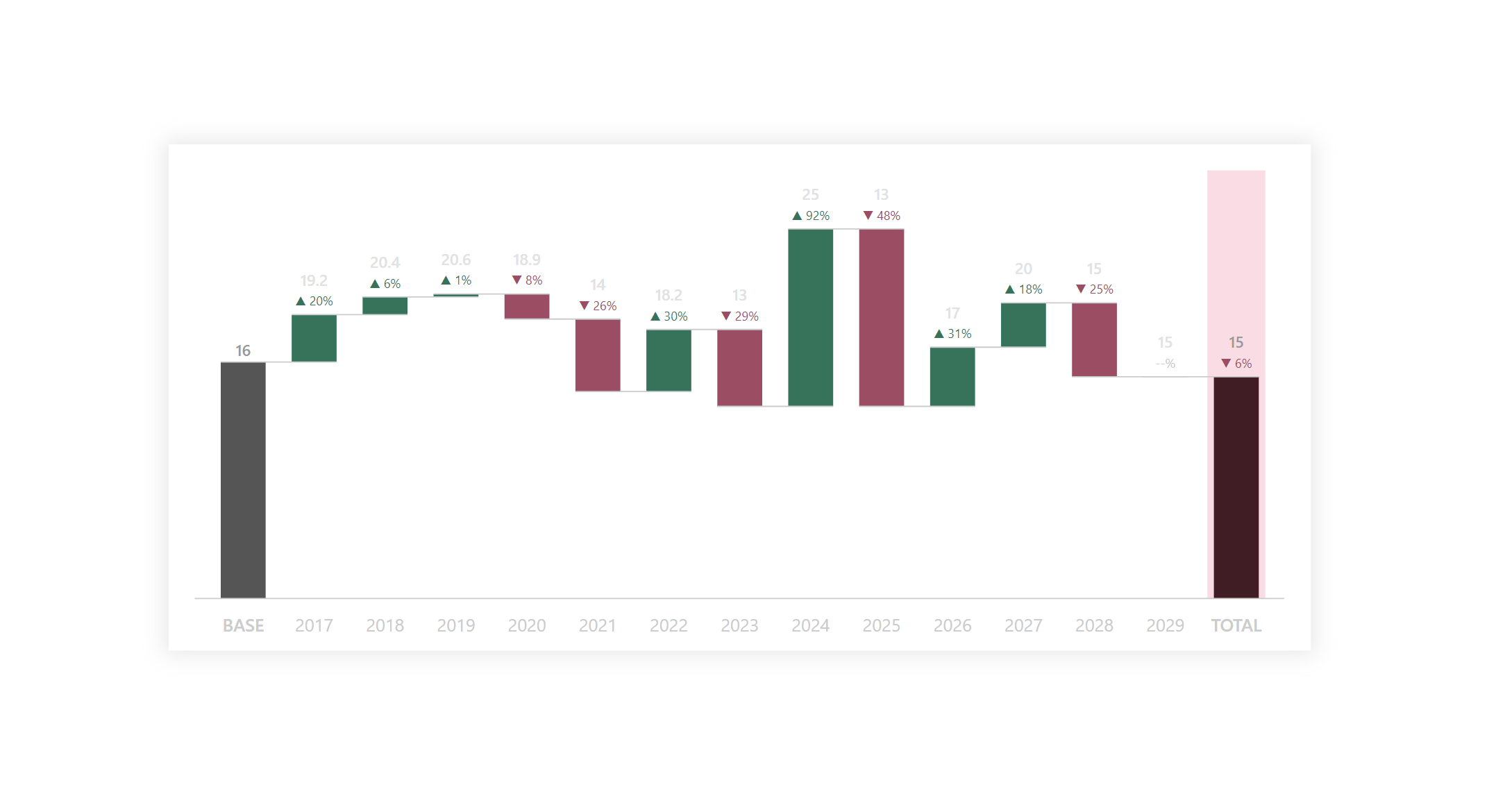
It very handy for understanding how an initial value is affected by of positive and negative results based on X-series.
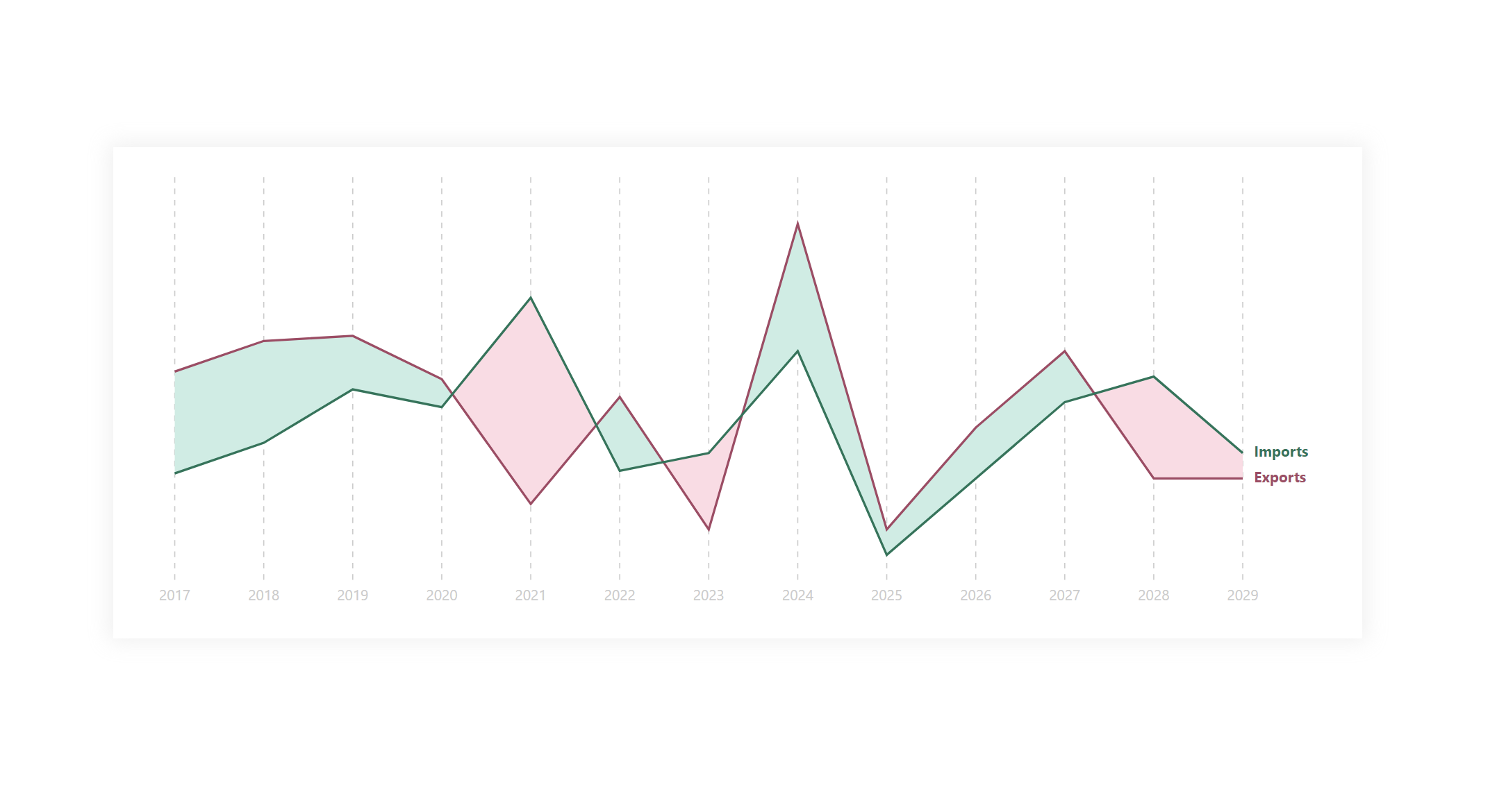
Hills and Falls is a special form of a line chart that focuses on delineating the areas between individual lines.
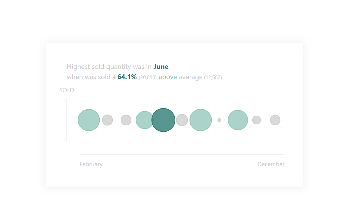
A bubble chart / Scatter plot is a great way to show the relationship of two quantities on each other.
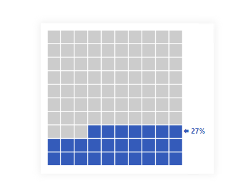
A waffle chart is a square display, usually consisting of smaller squares that support an understanding of % fulfilling from the total..
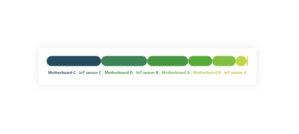
Sequence charts can be a great advantage but also a disadvantage at the same time...
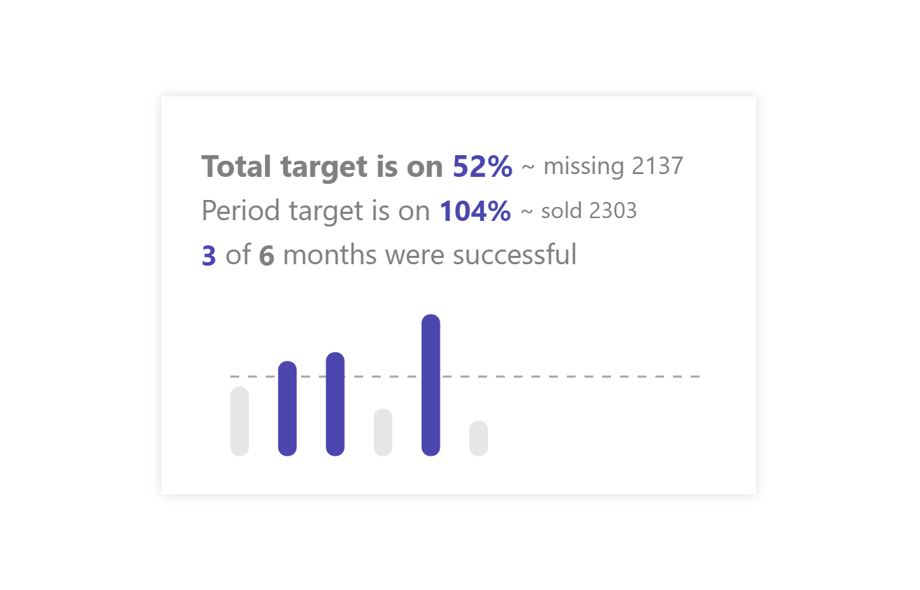
KPI cards are great because they target a quick, simple answer. Give them additional insight.
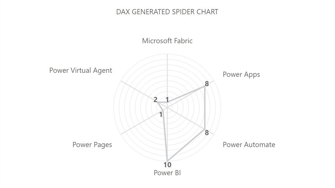
A spider or Radar chart is a visual showing multi-dimensional data in 2D.
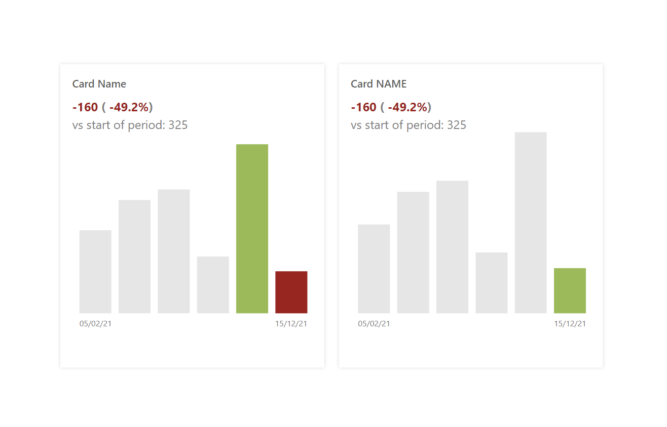
The composite card assembles various elements that we would normally have to combine from multiple visuals into one + gives us full control over it...
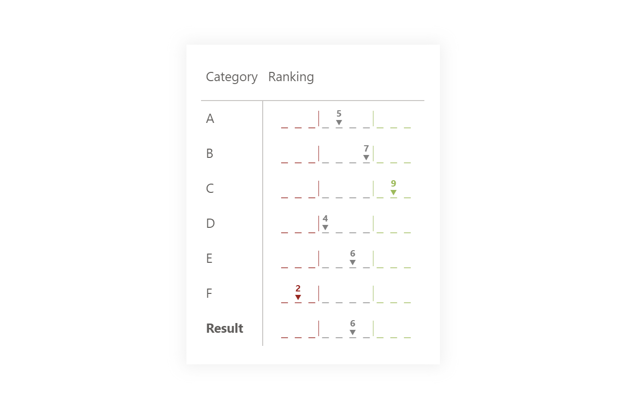
Are you evaluating a simple scale? Then, even for easy understanding, you can use the dashed score line, which simulates classic questionnaire scales.
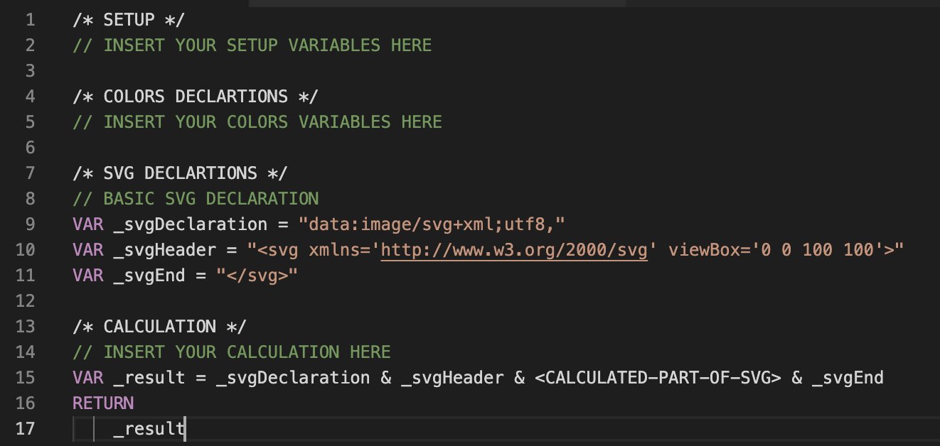
Want to create your own DAX generator for some SVG? This template may be useful for you.
It is a visual that fills the place because it can be replaced with a 100% bar chart. On the other hand, it can create a w-o-w effect.
It very handy for understanding how an initial value is affected by of positive and negative results based on X-series.
Hills and Falls is a special form of a line chart that focuses on delineating the areas between individual lines.
A bubble chart / Scatter plot is a great way to show the relationship of two quantities on each other.
A waffle chart is a square display, usually consisting of smaller squares that support an understanding of % fulfilling from the total..
Sequence charts can be a great advantage but also a disadvantage at the same time...
KPI cards are great because they target a quick, simple answer. Give them additional insight.
A spider or Radar chart is a visual showing multi-dimensional data in 2D.
The composite card assembles various elements that we would normally have to combine from multiple visuals into one + gives us full control over it...
Are you evaluating a simple scale? Then, even for easy understanding, you can use the dashed score line, which simulates classic questionnaire scales.
Want to create your own DAX generator for some SVG? This template may be useful for you.
It is a visual that fills the place because it can be replaced with a 100% bar chart. On the other hand, it can create a w-o-w effect.
It very handy for understanding how an initial value is affected by of positive and negative results based on X-series.
Hills and Falls is a special form of a line chart that focuses on delineating the areas between individual lines.
A bubble chart / Scatter plot is a great way to show the relationship of two quantities on each other.
A waffle chart is a square display, usually consisting of smaller squares that support an understanding of % fulfilling from the total..
Sequence charts can be a great advantage but also a disadvantage at the same time...
KPI cards are great because they target a quick, simple answer. Give them additional insight.
A spider or Radar chart is a visual showing multi-dimensional data in 2D.
The composite card assembles various elements that we would normally have to combine from multiple visuals into one + gives us full control over it...
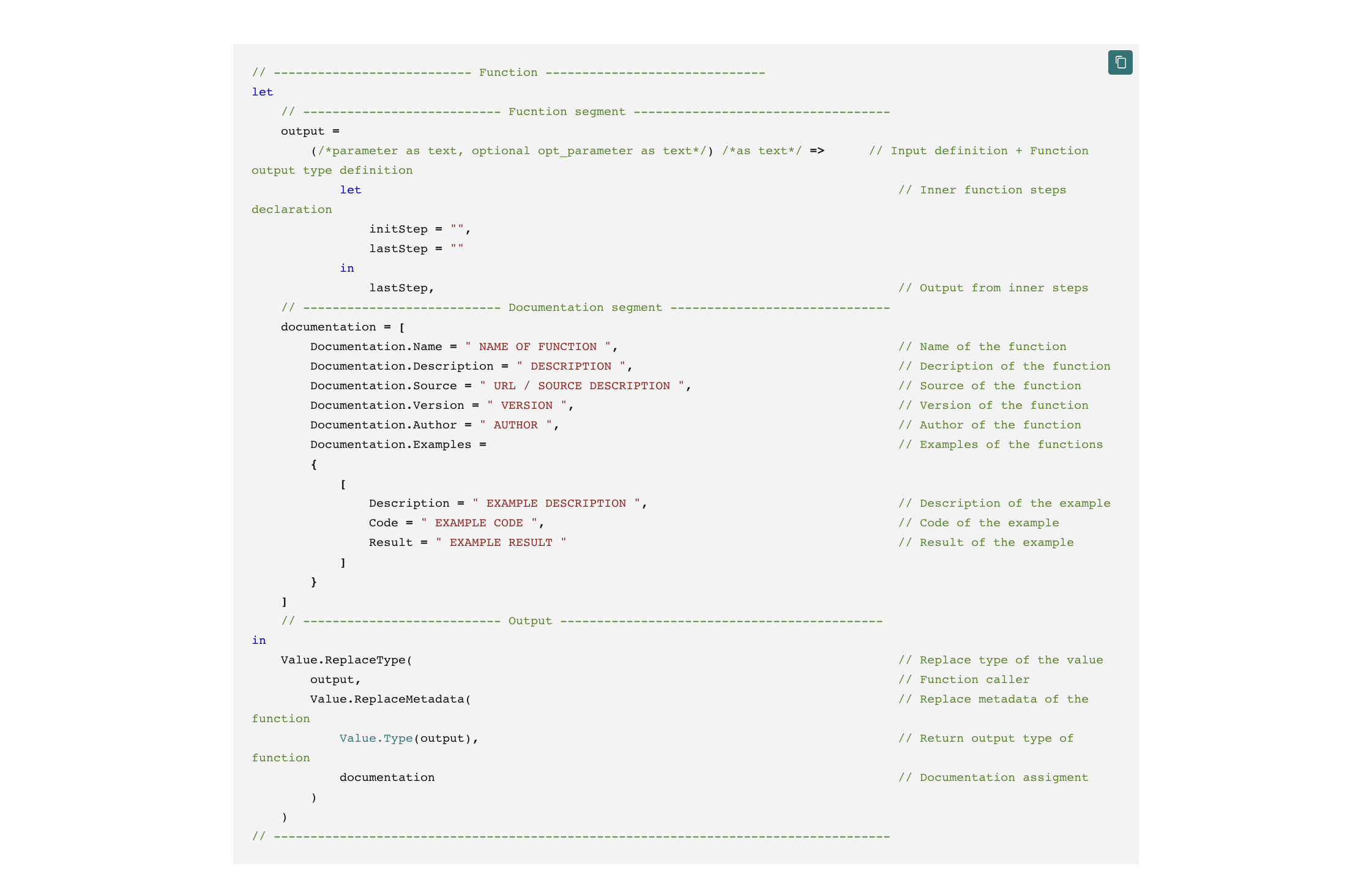
Documentation of the ETL code is crucial for subsequent reusability and the ability to know your procedure.
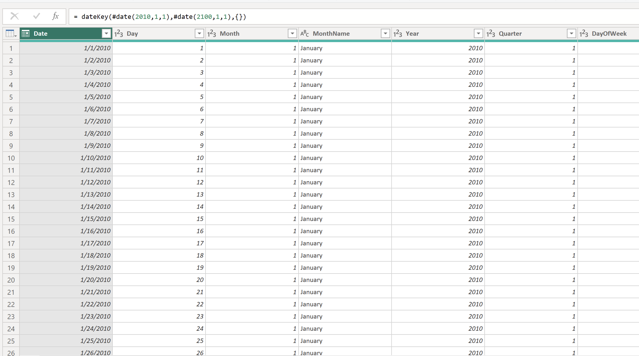
The date dimension is a dimension that cannot be missing from any model. The general rule says that it should come from the source, but if it is no...
Are you evaluating a simple scale? Then, even for easy understanding, you can use the dashed score line, which simulates classic questionnaire scales.
Want to create your own DAX generator for some SVG? This template may be useful for you.
A spider or Radar chart is a visual showing multi-dimensional data in 2D.
The composite card assembles various elements that we would normally have to combine from multiple visuals into one + gives us full control over it...
Are you evaluating a simple scale? Then, even for easy understanding, you can use the dashed score line, which simulates classic questionnaire scales.
Documentation of the ETL code is crucial for subsequent reusability and the ability to know your procedure.
The date dimension is a dimension that cannot be missing from any model. The general rule says that it should come from the source, but if it is no...
Documentation of the ETL code is crucial for subsequent reusability and the ability to know your procedure.
The date dimension is a dimension that cannot be missing from any model. The general rule says that it should come from the source, but if it is no...
It is a visual that fills the place because it can be replaced with a 100% bar chart. On the other hand, it can create a w-o-w effect.
It very handy for understanding how an initial value is affected by of positive and negative results based on X-series.
Hills and Falls is a special form of a line chart that focuses on delineating the areas between individual lines.
A bubble chart / Scatter plot is a great way to show the relationship of two quantities on each other.
A waffle chart is a square display, usually consisting of smaller squares that support an understanding of % fulfilling from the total..
Sequence charts can be a great advantage but also a disadvantage at the same time...
KPI cards are great because they target a quick, simple answer. Give them additional insight.