


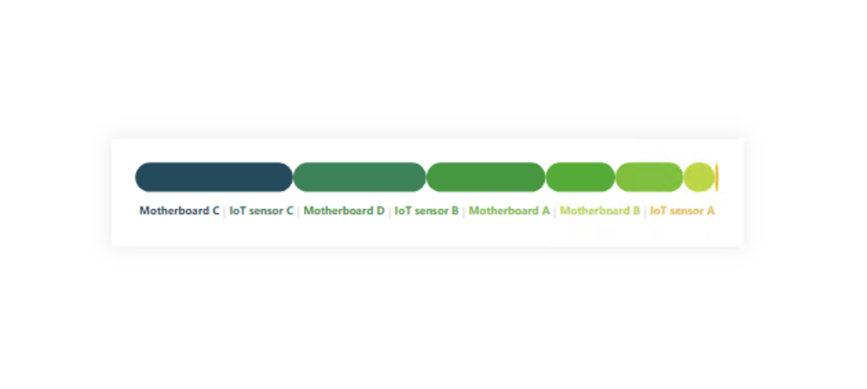
It’s a double-edged sword and crucial to get the proper grip. First, you need to realize that the positions of the individual categories in the chart will change. They will change depending on the sequential order.
This is an advantage because I can immediately see which, for example, product is the best and which is the worst. Suppose I keep the same colors for each category. In that case, it’s okay because I won’t confuse the user, and I can use the same bars in other parts of the report for the same categories and thus eliminate unnecessary legends. On the other hand, it can cause the need to define a large number of colors, and thus I have to pay more attention to the colors I choose so that it does not create an unreadable carousel of colors.
If I have more categories in such a graph, it is better to mark only the necessary categories in color. These can be some superior category or the highest / lowest. Just be careful that in a 100% graph, the lowest percentage can easily be only 0.01%; thus, it will not be visible. (Again, it can be good, but it doesn’t have to be. It depends on the context.) At the same time, it is possible to use a gradient in such a case. With the gradient, again, be careful about choosing the colors between which you will make a color shift because you can end up with a circus again or entirely throw off the user’s perception of the context. After all, one category can easily have more colors if the same procedure for defining this color is not applied to other graphs/tables, etc.
DAX Template
The description labels within the template should guide you to the individual variables and elements that you can/should modify. Of course, this is a template, so feel free to customize it to your heart’s content, and it just provides a base. Everything else depends on your needs and ideas.
/* SETUP */
VAR _size = 500 // SIZE OF THE IMAGE (will be +10)
VAR _initTbl = // ADD YOUR TABLE, PERIOD COLUMN (DATE, MONTH, QUARTER, YEAR,...) + MEASURE HERE
    ADDCOLUMNS (
        SELECTCOLUMNS ( SUMMARIZE ( <TABLE>, <COLUMN-FOR-DATE-PERIOD> ), "@dtPeriod", <COLUMN-FOR-DATE-PERIOD> ),
        "@vl", <MEASURE>
    )
/* COLORS */
// BETWEEN YOUR COLORS WILL BE CREATED A LINEAR GRADIENT
// FIRST COLOR DEFINED BY HSL
VAR _fHue = 195
VAR _fSat = 66
VAR _fLig = 22
// SECOND COLOR DEIFNED BY HSL
VAR _sHue = 49
VAR _sSat = 82
VAR _sLig = 51
/* SVG DECLARTIONS */
VAR _svgDeclaration = "data:image/svg+xml;utf8,"
VAR _svgHeader = "<svg xmlns='http://www.w3.org/2000/svg' width='"&_size+10&"' height='60'>" // _size+10px for the padding
VAR _svgEnd = "</svg>"
/* CALCULATION */
VAR _counter =
    COUNTROWS ( _initTbl )
VAR _total =
    SUMX ( _initTbl, [@vl] )
VAR _maxValue =
    MAXX ( _initTbl, [@vl] )
VAR _ranked =
    ADDCOLUMNS (
        ADDCOLUMNS (
            _initTbl,
            "@rowNum", ROWNUMBER ( _initTbl, ORDERBY ( [@vl], DESC ) ) // WILL BE USED AS A STEP MODIFICATOR FOR THE LINEAR GRADIENT
        ),
        "@color",
            VAR _sel =
                IF (
                    [@rowNum] = 1, // FIRST VALUE SHOULD HAVE INITIAL COLOR DEFINITION
                    "hsl( " & _fHue & ", " & _fSat & "%, " & _fLig & "%)",
                    // LINEAR GRADEINT CALCULATION
                    VAR _diffHue = ( ( _fHue - _sHue ) / _counter ) * [@rowNum]
                    VAR _diffSat = ( ( _fSat - _sSat ) / _counter ) * [@rowNum]
                    VAR _diffLig = ( ( _fLig - _sLig ) / _counter ) * [@rowNum]
                    VAR _huePrepare = ABS ( _fHue - _diffHue )
                    VAR _hue = IF(_huePrepare>360,_huePrepare-360,_huePrepare)
                    RETURN
                        "hsl( "
                            & _hue & ", "
                            & ABS ( _fSat - _diffSat ) & "%, "
                            & ABS ( _fLig - _diffLig ) & "%)"
                )
            RETURN
                _sel,
        "@position",
            ROUND ( ( [@vl] / _total ) * _size, 2 )
    )
VAR _bars =
    "<g stroke = 'none'>"
        & CONCATENATEX (
            _ranked,
            VAR _rn = [@rowNum]
            VAR _maxx =
                SUMX (
                    WINDOW ( 1, ABS, 0, REL, _ranked, ORDERBY ( [@vl], DESC ) ),
                    [@position]
                )
            RETURN
                "<rect fill='" & [@color] & "' x='" & _maxx - [@position] + 5 & "' y='5' height='25' width='" & [@position] & "' rx='12.5' />",
            "",
            [@vl], DESC
        ) & "</g>"
VAR _texts = // LEGEND DEFINITION !!! MAY NEED TO CHANGE THE FONT SIZE !!!
    "<text x='50%' y='47.5' font-size='60%' text-anchor='middle' dominant-baseline='middle' fill='#E6E6E6' font-family='Segoe UI' font-weight='bold'>"
        & CONCATENATEX (
            _ranked,
            "<tspan fill='" & [@color] & "'>" & [Product name] & "</tspan>",
            \" | \",
            [@vl], DESC
        ) & "</text>"
VAR _result = _svgDeclaration & _svgHeader & _bars & _texts & _svgEnd
RETURN
    _result
Power BI Core Visuals supporting this template
Like most other SVGs that we want to dynamically generate, we can use them within three native visuals.
- Matrix
- New Card
- Table
The template is again aimed more at use within the new CARD visual, but with a bit of MACGyver work, it could also be used well in the other options mentioned. However, the maintenance would then be significantly higher.
Set up of new Card visual
- Visual
- Values: Off
- Layout
- Vertical alignment: Middle
- Cards
- Padding: Custom -> 0px (all)
- Image: On
- Image type: Image URL
- Image Url: fx
- Transparency: 0%
- Position: Bottom
- Padding: 0px
- Size: AUTO
- General
- Size
- Width: 530px
- Height: 90px
- Padding: 15px (all)
- Size