


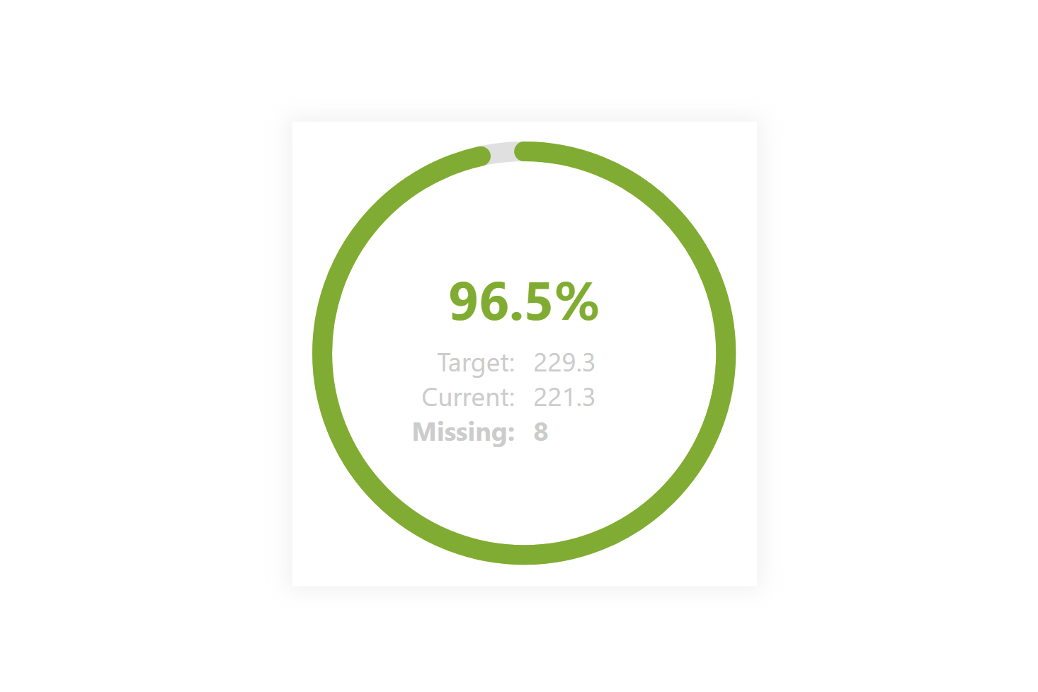
This chart can serve you well if you need to make an impression or fill a place. What I mostly miss in this type of graph is that it shows only %, not subordinate detail, which needs to be added with additional visuals. That detail is added here so that we don’t send unnecessary additional queries to the dataset.
DAX Template
The description labels within the template should guide you to the individual variables and elements that you can/should modify. Of course, this is a template, so feel free to customize it as much as you would like, this is just a base. Everything else depends on your needs and ideas.
/* SETUP */
VAR _total = <TOTAL-MEASURE> // Will be used as a target
VAR _value = <MEASURE> // Will be used as a current value

// CANVAS SIZE
VAR _height = 300
VAR _width = 429
VAR _CanvasSize = MIN(_height,_width) // Canvas size

// PADDING SETUP
VAR _paddning = 15 // Padding between the circle and the canvas

/* COLOR DEFINITION */
VAR _positive = "#73AE00" // Positive Color
VAR _neutral = "#E7E74E" // Neutral Color
VAR _negative = "#7D1D3A" // Negative Color

/* PRE CALCULATION */
VAR _halfSize = _CanvasSize/2 // Half of the canvas size
VAR _r = _halfSize-_paddning*1.5 // Radius of the circle
VAR _round = 2*PI()*_r
VAR _perc = _value/_total // Percentage of the current value
VAR _ratio = _round-_round*_perc // Ratio of the current value
VAR _clr =  // Determine the color of the circle based on the percentage
    SWITCH(TRUE(),
        _perc>=0.75,_positive, // Positive Color
        _perc>=0.5,_neutral, // Neutral Color
        _negative // Negative Color
    )

/* STYLE DECLARTIONS */
VAR _styles =
"
  <style>
    text{
        font-family: Segoe UI;
    }
    .backgroundCircle{
      transform:rotate(-90deg) translate(-"&(_height+_width)/2&"px, "&(_width-_height)/2&"px);
    }
    .backgroundCircle{
      fill: transparent;
      stroke-width: "&_paddning&";
    }
    .background{
      stroke: #e0e0e0;
    }
    .filling{
      stroke: "&_clr&";
      stroke-linecap: round;
      stroke-dasharray: "&_round&";
      stroke-dashoffset: "&_ratio&";
    }
    .mainText{
      fill: "&_clr&";
      font-size: 250%;
      text-anchor: middle;
      dominant-baseline: middle;
      font-weight: bold;
    }
    .subTexts{
      fill: #CCCCCC;
      font-size: 125%;
      dominant-baseline: middle;
    }
    .leftPositioned{
        text-anchor: end;
    }
    .rightPositioned{
        text-anchor: start;
    }
    .bolden{
        font-weight: bold;
    }
  </style>
"

/* SVG DECLARTIONS */
VAR _svgDeclaration = "data:image/svg+xml;utf8,"
VAR _svgHeader = "<svg xmlns='http://www.w3.org/2000/svg' height='" & _height & "' width='" & _width & "'>"
VAR _svgEnd = "</svg>"

/* CALCULATION */
VAR _sv =
"
  <g class='backgroundCircle'>
  <circle r='"&_r&"' cx='50%' cy='50%' class='background' />
  <circle r='"&_r&"' cx='50%' cy='50%' class='filling'/>
  </g>
  <g class='mainText'>
  <text x='50%' y='40%' >"&FORMAT(_perc,"0.0%")&"</text>
  </g>
  <g class='subTexts'>
  <g class='leftPositioned'>
  <text x='48%' y='52.5%' >"&"Target:"&"</text>
  <text x='48%' y='60%' >"&"Current:"&"</text>
  <text x='48%' y='67.5%' class='bolden'>"&"Missing:"&"</text>
  </g>
  <g class='rightPositioned'>
  <text x='52%' y='52.5%' >"&_total&"</text>
  <text x='52%' y='60%' >"&_value&"</text>
  <text x='52%' y='67.5%' class='bolden'>"&_total-_value&"</text>
  </g>
  </g>
"
VAR _result = _svgDeclaration & _svgHeader & _styles & _sv & _svgEnd
RETURN
   _result
Power BI Core Visuals supporting this template
Like most other SVGs that we want to dynamically generate, we can use them within three native visuals.
- Matrix
- New Card
- Table
The template is again aimed more at use within the new CARD visual, but with a bit of MACGyver work, it could also be used well in the other options mentioned. However, the maintenance would then be significantly higher.
Set up of new Card visual
- Visual
- Values: Off
- Layout
- Vertical alignment: Middle
- Cards
- Padding: Custom -> 0px (all)
- Image: On
- Image type: Image URL
- Image Url: fx
- Transparency: 0%
- Position: Bottom
- Padding: 0px
- Size: Auto
- General
- Size
- Width: 1260px
- Height: 350px
- Padding: 0px (all)
- Size
Gallery