


Quick story
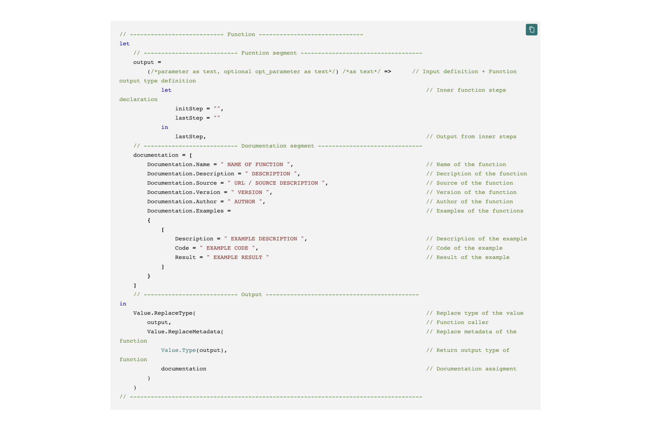
Trying to convey as much information as possible often leads us to the need to use multiple visuals at the same time. But if we want to reduce their number to avoid the problems that a higher number of them can cause on the page, then we have to reach for some other solution. One such option is using dynamic titles and subtitles that visuals provide.
But it brings with it limitations, which are a big problem in relation to simple readability. One such is, for example, the limitation to only one color of the text and the inability to make only part of the text bold. So I would come back to the fact that I need more visuals. SVG can solve all of that, and that’s why this template was created.
DAX Template
The template is fully editable, so feel free to dig into it and customize it to your liking.
/* SETUP */
VAR _spaceBetweenColumns = 3 // Space that will be reserved between columns
VAR _maxSizeOfColumn = 20 // Max size of column, if the calculated value is bigger than this, the column will be this size
VAR _svgSize = 300 // Size of the SVG square in viewbox
VAR _initionTbl =
ADDCOLUMNS (
SELECTCOLUMNS (
SUMMARIZE (
<INSERT-YOUR-TABLE>,
<INSERT-YOUR-PERIOD-COLUMN>
),
"@xAxisPeriod", <INSERT-YOUR-PERIOD-COLUMN>
),
"@val", <INSERT-YOUR-MEASURE>
)
/* COLORS DECLARTIONS */
VAR _green = "#95BB4B" // Will be used for highes column
VAR _red = "#A41515" // Will be used for lowest column
VAR _grey = "#E6E6E6" // Will be used for all other columns
/* SVG Table Required */
VAR _preparedTbl =
// ADD YOUR TABLE, PERIOD COLUMN (DATE, MONTH, QUARTER, YEAR,...) + MEASURE HERE
ADDCOLUMNS (
_initionTbl,
"@rowNum",
ROWNUMBER (
_initionTbl,
ORDERBY ( [@xAxisPeriod], ASC )
)
)
/* SVG DECLARTIONS */
VAR _svgDeclaration = "data:image/svg+xml;utf8,"
VAR _svgHeader = "<svg xmlns='http://www.w3.org/2000/svg' x='0px' y='0px' viewBox='0 0 " & _svgSize & " " & _svgSize & "'>"
VAR _svgEnd = "</svg>" /* CALCULATION */
VAR _startOfPeriodTable =
INDEX (
1,
_preparedTbl,
ORDERBY ( [@xAxisPeriod], ASC )
)
VAR _endOfPeriodTable =
INDEX (
-1,
_preparedTbl,
ORDERBY ( [@xAxisPeriod], ASC )
)
VAR _endOfPeriod =
MAXX (
_endOfPeriodTable,
[@xAxisPeriod]
)
VAR _startOfPeriod =
MINX (
_startOfPeriodTable,
[@xAxisPeriod]
)
VAR _maxValue =
MAXX (
_preparedTbl,
[@val]
)
VAR _minxValue =
MINX (
_preparedTbl,
[@val]
)
VAR _rowCounter =
COUNTROWS ( _preparedTbl )
VAR _divider =
DIVIDE (
1,
_rowCounter
)
VAR _resultSizeOfColumns =
VAR _cal =
ROUND (
DIVIDE (
100 - ( ( _rowCounter + 1 ) * _spaceBetweenColumns ),
_rowCounter
),
1
)
RETURN
IF (
_cal > _maxSizeOfColumn,
_maxSizeOfColumn,
_cal
)
VAR _firstValue =
MINX (
_startOfPeriodTable,
[@val]
)
VAR _lastValue =
MAXX (
_endOfPeriodTable,
[@val]
)
VAR _Diff = _lastValue - _firstValue
VAR _Div =
FORMAT (
DIVIDE (
_lastValue,
_firstValue
) - 1,
"0.0%"
)
VAR _textColor =
IF (
_Diff >= 0,
_green,
_red
)
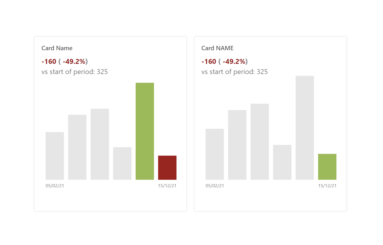
VAR _initialText = "<text y='5%' font-weight='bold' font-size='15px' font-family='Segoe UI' dominant-baseline='middle' text-anchor='start' fill='#808080'>
<tspan fill='" & _textColor & "'>" & _Diff & "</tspan> (
<tspan fill='" & _textColor & "'>" & _Div & "</tspan>)
</text>"
VAR _supportText = "<text y='12.5%' font-size='15px' font-family='Segoe UI' dominant-baseline='middle' text-anchor='start' fill='#808080'>
vs start of period: " & _firstValue & "
</text>"
VAR _columns =
CONCATENATEX (
_preparedTbl,
VAR _colorOfColumn = // Rules for coloring columns
SWITCH (
[@val],
_maxValue, _green,
_minxValue, _red,
_grey
) // Rules for coloring columns
VAR _startOfColumn =
ROUND (
DIVIDE (
[@val],
_maxValue
) * 70,
1
)
VAR _positionCounter = ( ( [@rowNum] - 1 ) * _resultSizeOfColumns ) + ( _spaceBetweenColumns * [@rowNum] )
RETURN
"<rect x='" & _positionCounter & "%' y='" & 90 - _startOfColumn & "%' width='" & _resultSizeOfColumns & "%' height='" & _startOfColumn & "%' fill='" & _colorOfColumn & "' opacity='1' style='outline: none;'></rect>"
)
VAR _chartText =
VAR _endPosition = ( _rowCounter * _resultSizeOfColumns ) + ( _spaceBetweenColumns * _rowCounter )
RETURN
"<text y='92.5%' font-size='10px' font-family='Segoe UI' dominant-baseline='hanging' fill='#808080'>
<tspan x='" & _spaceBetweenColumns & "%' text-anchor='start'>"
& FORMAT (
_startOfPeriod,
"dd/mm/yy" // Change this to your prefered date format or remove it
) & "</tspan>"
& IF (
_rowCounter > 1,
"<tspan x='" & _endPosition & "%' text-anchor='end'>"
& FORMAT (
_endOfPeriod,
"dd/mm/yy" // Change this to your prefered date format or remove it
) & "</tspan>",
""
) & "</text>"
VAR SVGImageURL = _svgDeclaration & _svgHeader & _initialText & _supportText & _columns & _chartText & _svgEnd
RETURN
SVGImageURLPower BI Core Visuals supporting this template
Like most other SVGs that we want to dynamically generate, we can use them within three native visuals.
- Matrix
- New Card
- Table
This template is intended for the New Card visual. Still, I can imagine it quite well using Calculation Groups within the Matrix or Table visual, where the inserted Measure would be replaced with SELECTEDMEASURE(), and thus the given card could be rendered for any input measure.
Set up of new Card visual
The primary thing to be aware of is that this card requires resizing for everything to work properly. You should also set the same size as in the template within the used visual. The rest of the settings are entirely up to you. For Tables and Matrix, it is the main output of the cell, but within the card, you can add another insight within the input value / its label.
In case of a card visual, you can use the following settings for the best experience:
- Visual
- Values: Off
- Layout
- Vertical alignment: Middle
- Cards
- Padding: Custom -> 15px (top, left, right) 0px (bottom)
- Image: On
- Image type: Image URL
- Image Url: fx
- Transparency: 0%
- Position: Bottom
- Padding: 0px
- Size: 304px
- General
- Size
- Width: 360px
- Height: 372px
- Padding: 5px (all)
- Size