


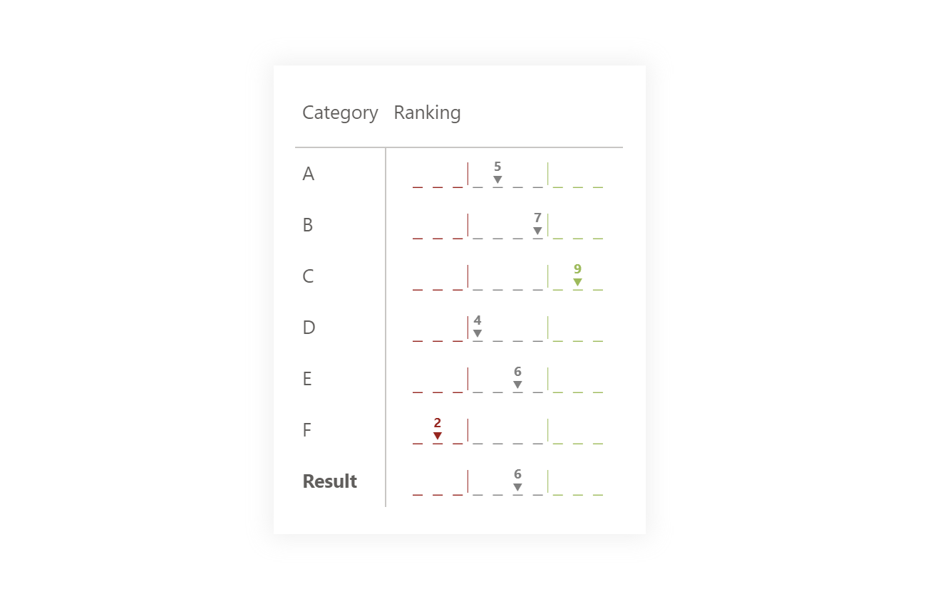
As part of questionnaire surveys, these types of score lines have been used for a long time because they are easy to read and users understand them. They can be presented in different ways. As with different colors for the text, and lines, it can have different parts with which the necessary detail can be added.
DAX Template
Creating this visual is simple. It is necessary to create individual lines representing possible results and then place an appropriate value above them and, if possible, some indication that the given value is selected/obtained.
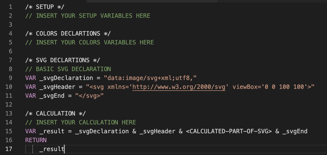
/* SETUP */
VAR _insertedMeasure = <MEASURE> // Measure that you want to use for generating this visual (its value should be one of categories)
VAR _categories = 10 // Number of categories/marker lines that you want to have
VAR _XsizeInVisual = 160 // Size that you setted up in the visual for width
VAR _YsizeInVisual = 20 // Size that you setted up in the visual for height

/* COLORS DECLARTIONS */
VAR _red = "#A41515"
VAR _green = "#95BB4B"
VAR _grey = "#808080"

/* SVG DECLARTIONS */
VAR _svgDeclaration = "data:image/svg+xml;utf8,"
VAR _svgHeader = "<svg xmlns='http://www.w3.org/2000/svg' viewBox='0 0 " & _XsizeInVisual & " " & _YsizeInVisual & "'>"
VAR _svgEnd = "</svg>"

/* CALCULATION */
VAR _initSize = 100 // Base size of bar that will be divided into categories
VAR _binSize =
    ROUND ( _initSize / ( _categories + 2 ), 2 )
VAR _modification = _initSize - _binSize * 2
VAR _size =
    ROUND ( _modification / ( ( _categories * 2 ) - 1 ), 2 )
VAR _topBin =
    ROUNDUP ( _categories * 0.7, 0 )
VAR _bottomBin =
    ROUNDDOWN ( _categories * 0.3, 0 )
VAR _binModification = _binSize * 0.75
VAR _position = ( ( _insertedMeasure * 2 - 1 ) * _size - ( _size / 2 ) ) + _binSize
VAR _generator =
    SELECTCOLUMNS ( GENERATESERIES ( 1, _categories, 1 ), "@id", [Value] )
VAR _lines =
    CONCATENATEX (
        _generator,
        VAR _color = // Color of the line is based on the category and % interval >=30% {_red},<70% {_green}, between {_grey}
            SWITCH (
                TRUE (),
                [@id] <= _bottomBin, _red,
                [@id] > _topBin, _green,
                _grey
            )
        VAR _preCalculation = ( [@id] * 2 - 1 ) * _size
        RETURN
            "<line x1='" & ( _preCalculation - ( _size / 2 ) ) + _binModification & "%' y1='99%' x2='" & ( _preCalculation + ( _size / 2 ) ) + _binModification & "%' y2='99%' stroke='" & _color & "'/>",
        ""
    )
VAR _linesCombiner =
    VAR _topPosition_ = ( ( _topBin * 2 ) * _size ) + _binModification
    VAR _bottomPosition = ( ( _bottomBin * 2 ) * _size ) + _binModification
    RETURN
        "<g stroke-width='1'>" & _lines & "</g>" & "<line x1='" & _topPosition_ & "%' y1='10%' x2='" & _topPosition_ & "%' y2='90%' stroke='" & _green & "' stroke-width='0.5' />" & "<line x1='" & _bottomPosition & "%' y1='10%' x2='" & _bottomPosition & "%' y2='90%' stroke='" & _red & "' stroke-width='0.5' />"
VAR _text =
    VAR _color = // Color of the text is based on the category and % interval >=30% {_red},<70% {_green}, between {_grey}
        SWITCH (
            TRUE (),
            _insertedMeasure <= _bottomBin, _red,
            _insertedMeasure > _topBin, _green,
            _grey
        )
    RETURN
        "<g dominant-baseline='auto' text-anchor='middle' font-weight='bold' font-family='Segoe UI' font-size='6pt'>" & "<text x='" & _position & "%' y='85%' fill='" & _color & "'>" & "▼" & "</text>" & "<text x='" & _position & "%' y='40%' fill='" & _color & "' font-size='7pt'>" & _insertedMeasure & "</text>" & "</g>"
VAR _result = _svgDeclaration & _svgHeader & _text & _linesCombiner & _svgEnd
RETURN
    _result
Power BI Core Visuals supporting this template
Like most other SVGs that we want to dynamically generate, we can use them within three native visuals.
- Matrix
- New Card
- Table
This template’s application within the Matrix visual suits me best due to the possibility of showing individual category results. Of course, if we were to show a scale rating of an issue within the card, it could also be used. On the other hand, many better variants can be placed in card visuals that will show much more detail than just “rating”.