


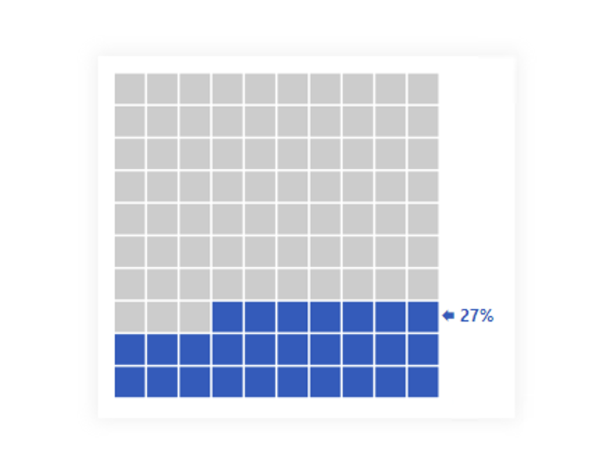
A waffle chart can often be used instead of a two-category pie chart. However, its use mainly aims to support the understanding of some progress or fulfill some percentage goal. Therefore, it is a best always practice to show you the value reached to avoid creating problems in understanding the user when reading this visual.
Because you can use a 10x10 square grid, where one cube = 1% if we use a different model, it is good to let the user know if we used, for example, 5x5 and one cube would mean 4%; then again, it can be confusing for the user because counting by 4% is unnatural for most people. At such a moment, it would be better to use a rectangular shape with a ratio of 5x4 or 4x5, so that one cube = 5%. Then we would have at least 50% filling in the middle of the chart.
At the same time, I give one more recommendation. It is possible to fill individual squares partially. This can also help with understanding the gradual progress, but it can be counterproductive due to the need to read the graph as more layered. So be very careful if you try something like this. I recommend using the maximum division of the square by quarters.
DAX Template
The description labels within the template should guide you to the individual variables and elements that you can/should modify. Of course, this is a template, so feel free to customize it to your heart’s content, and it just provides a base. Everything else depends on your needs and ideas.
/* SETUP */
VAR _val = <MEASURE> // INSERT YOUR MEASURE HERE <- OUTPUT OF MEASURE SHOUD BE WHOLE NUMBER BETWEEN 0 AND 100
VAR _space = 7.5 // SPACE BETWEEN CUBES
VAR _imageSize = 300 // HEIGHT SIZE OF IMAGE
/* COLORS DECLARTIONS */
VAR _filledCubeColor = "#255CC0" // COLOR OF FILLED CUBES
VAR _nonfilledCubeColor = "#CCCCCC" // COLOR OF NON FILLED CUBES
/* SVG DECLARTIONS */
VAR _svgDeclaration = "data:image/svg+xml;utf8,"
VAR _svgHeader = "<svg xmlns='http://www.w3.org/2000/svg' height = '" & _imageSize & "' width = '" & _imageSize + 50 & "'>" // ADDING 50PX TO WIDTH FOR TEXT
VAR _svgEnd = "</svg>" /* CALCULATION */
VAR _size = 10 // NUMBER OF CUBES IN ONE ROW !!! IF YOU CHANGE THAT YOU NEED TO CHANGE ALSO _cubes._clr !!!
VAR _generateSeries =
    SELECTCOLUMNS ( GENERATESERIES ( 0, ( _size * _size ) - 1, 1 ), "@vl", [Value] ) // GENERATING SERIES FROM 0 TO 99
VAR _cubeSize =
    ROUND ( DIVIDE ( _imageSize - ( ( _size + 1 ) * _space ), _size ), 1 )
VAR _cubes =
    CONCATENATEX (
        _generateSeries,
        VAR _mod =
            _size - MOD ( [@vl], _size )
        VAR _rounder =
            _size
                - ROUNDUP ( DIVIDE ( [@vl] + 1, _size ), 0 )
        VAR _cubeXPosition = ( _mod * _cubeSize ) + ( _space * _mod ) - ( _cubeSize + _space ) // preparing X postion of cube
        VAR _cubeYPosition = ( _rounder * _cubeSize ) + ( _space * _rounder + 1 ) // preparing Y postion of cube
        VAR _clr =
            IF ( _val >= [@vl] + 1, _filledCubeColor, _nonfilledCubeColor ) // assigning color to cube
        VAR _cube = "<rect x='" & _cubeXPosition & "' y='" & _cubeYPosition & "' height='" & _cubeSize & "' width='" & _cubeSize & "' fill='" & _clr & "' />"
        RETURN
            _cube
    )
VAR _text =
    VAR _rounder =
        _size - ROUNDUP ( DIVIDE ( _val, _size ), 0 )
    VAR _textYPosition = ( _rounder * _cubeSize ) + ( _space * _rounder + 1 ) + ( ( _cubeSize + _space ) / 2 )
    RETURN
        "<text x='" & _imageSize - _space & "' y='" & _textYPosition & "' fill='" & _filledCubeColor & "' font-family='Segoe UI' alignment-baseline='middle' font-weight='bold' font-size='95%'>🡄 " & _val & "%</text>"
VAR _result = _svgDeclaration & _svgHeader & _cubes & _text & _svgEnd
RETURN
    _result
Power BI Core Visuals supporting this template
Like most other SVGs that we want to dynamically generate, we can use them within three native visuals.
- Matrix
- New Card
- Table
The template is again aimed more at use within the new CARD visual, but with a bit of MACGyver work, it could also be used well in the other options mentioned. However, the maintenance would then be significantly higher.
Set up of new Card visual
- Visual
- Values: Off
- Layout
- Vertical alignment: Middle
- Cards
- Padding: Custom -> 0px (top, left, right) 0px (bottom)
- Image: On
- Image type: Image URL
- Image Url: fx
- Transparency: 0%
- Position: Bottom
- Padding: 0px
- Size: Auto
- General
- Size
- Width: 380px
- Height: 330px
- Padding: 15px (all)
- Size