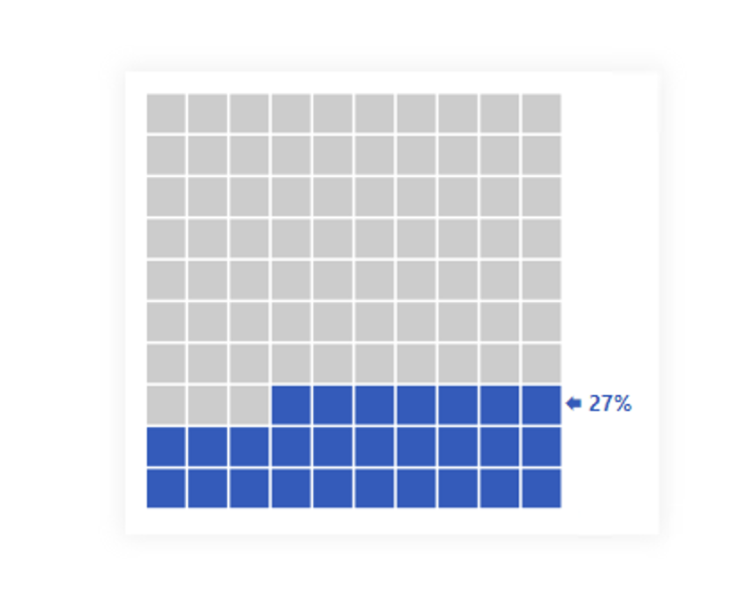


On the other hand, it can be used for many other things. For example, I want to do an analysis over time for data where daily/monthly/quarterly / etc / results are not directly related. Although it is not the best option because there is a column chart, it is still an enjoyable option that allows detecting fluctuations close to each other.
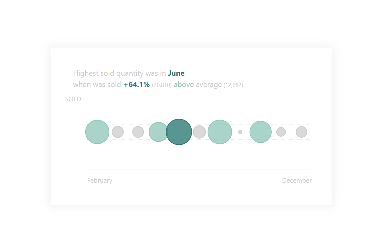
If it were a display within a standard Scatter plot in Power BI, setting dynamic bubble colors and various other specialties are either not natively supported or need to be done using a workaround. I wrote it myself to connect this graph with the associated detail.
DAX Template
The description labels within the template should guide you to the individual variables and elements that you can/should modify. Of course, this is a template, so feel free to customize it to your heart’s content, and it just provides a base. Everything else depends on your needs and ideas.
/* SETUP */
// In default this is set to work with <DATE> column as a period column, but you then need to change code for X axis text
VAR _initTbl = // ADD YOUR TABLE, PERIOD COLUMN (DATE, MONTH, QUARTER, YEAR,...) + MEASURE HERE
    ADDCOLUMNS (
        SELECTCOLUMNS ( SUMMARIZE ( <TABLE>, <COLUMN-FOR-DATE-PERIOD> ), "@dtPeriod", <COLUMN-FOR-DATE-PERIOD> ),
        "@vl", <MEASURE>
    )
VAR _YAxisText = "SOLD" // Y axis text (X axis text is defined in LOWER code)
VAR _maxSizeOfBubble = 7.5 // 7.5 is max size of bubble
/* STYLE DECLARTIONS */
VAR _style = // CSS of chart
"
<style>
        circle {
            fill-opacity: 0.75;
            stroke-width: 0.25;
        }

        path {
            stroke: #E6E6E6;
            stroke-width: 0.125;
        }

        line {
            stroke: #a2a2a2;
            stroke-width: 0.125;
            opacity: 0.5;
            stroke-dasharray: 1.5;
        }

        text{
            font-family: 'Segoe UI';
        }

        .axisTexts {
            dominant-baseline: middle;
            fill: #CCCCCC;
            font-size: 1.75pt;
        }

        .topBubble {
            fill: #00766E;
            stroke: #00766E;
        }

        .lowerThenAverage {
            fill: #CCCCCC;
            stroke: #CCCCCC;
        }

        .higherThenAverage
        {
            fill: #7EC8B8;
            stroke: #7EC8B8;
        }

        .textDetail {
            font-weight: bold;
            fill: #00766E
        }

        .subTextDetail {
            font-size: 75%;
        }

        #descriptionText {
            fill: #CCCCCC;
            font-size: 2pt;
            text-anchor: start;
        }
    </style>
"
/* SVG DECLARTIONS */
VAR _svgDeclaration = "data:image/svg+xml;utf8,"
VAR _svgHeader = "<svg xmlns='http://www.w3.org/2000/svg' width='100' height='50'>"
VAR _svgEnd = "</svg>"
/* CALCULATION */
VAR _space = 80 // inner width for bubble chart
VAR _counter = // number of periods
    COUNTROWS ( _initTbl )
VAR _positionModificator = // preparing space distribution for bubbles
    DIVIDE ( _space, _counter )
VAR _divPrepare = // dividing space for bubbles to maintain space between them
    DIVIDE ( _positionModificator, 2 )
VAR _spaceDistribution = // space distribution for bubbles
    IF ( _divPrepare > _maxSizeOfBubble, _maxSizeOfBubble, _divPrepare )
VAR _startOfPeriod = // start of period
    MINX ( _initTbl, [@dtPeriod] )
VAR _endOfPeriod = // end of period
    MAXX ( _initTbl, [@dtPeriod] )
VAR _average = // average value of measure !!! This Average is used as a divider for bubbles CSS classes (LOWER IN CODE)
    ROUND ( AVERAGEX ( _initTbl, [@vl] ), 0 )
VAR _maxValue = // max value of measure
    MAXX ( _initTbl, [@vl] )
VAR _sizeModificator = // preparing base size modificator of bubbles
    DIVIDE ( _spaceDistribution, _maxValue )
VAR _overPercentage = // percentage of max value over average
    DIVIDE ( _maxValue, _average ) - 1
//-------------------------------------//
// (*1.25 is for better visualisation)
VAR _upAverageLine = 25 + ( _sizeModificator * _average ) * 1.25 // upper line of average
VAR _downAverageLine = 25 - ( _sizeModificator * _average ) * 1.25 // lower line of average
//-------------------------------------//
VAR _chart = // Please change this part especially last TWO <text> elements if you want to change X AXIS TEXT
    "<g id='chart'>" & "
 <g id='axis'>
    <path d='M 5 16.5 V 33.5 M 10 25 H 90 M 10 38.5 H 90' />
    <line x1='10' x2='90' y1='" & _downAverageLine & "' y2='" & _downAverageLine & "' />
    <line x1='10' x2='90' y1='" & _upAverageLine & "' y2='" & _upAverageLine & "' />
    <text class='axisTexts' text-anchor='middle' x='5' y='13.5'>" & _YAxisText & "</text>
    <text class='axisTexts' text-anchor='start' x='10' y='42.5'>"
        & FORMAT ( DATE ( 2023, _startOfPeriod, 1 ), "MMMM" ) & "</text>
    <text class='axisTexts' text-anchor='end' x='90' y='42.5'>"
        & FORMAT ( DATE ( 2023, _endOfPeriod, 1 ), "MMMM" ) & "</text>
</g>
<g id='circles'>
 "
        & CONCATENATEX (
            _initTbl,
            VAR _classSelection = // CSS class selection for bubble
                SWITCH (
                    TRUE (),
                    [@vl] = _maxValue, "topBubble",
                    [@vl] >= _average, "higherThenAverage",
                    "lowerThenAverage"
                )
            VAR _rowNumber =
                ROWNUMBER ( _initTbl, ORDERBY ( [@dtPeriod], ASC ) )
            VAR _xPosition = _positionModificator * ( _rowNumber - 1 ) + 10 + _divPrepare
            VAR _sizeOfBubble = _sizeModificator * [@vl] * 1.25 // (*1.25 is for better visualisation)
            RETURN
                "<circle class='" & _classSelection & "' r='" & _sizeOfBubble & "' cx='" & _xPosition & "' cy='25' />",
            "",
            [@vl], ASC // All bubbles are shown from smallest to largest
        ) & "</g></g>"
VAR _description = // Description of what is happening in a chart
    "<g id='descriptionText'>" & "<text x='5' y='5'>Highest sold quantity was in <tspan class='textDetail'>"
        & FORMAT (
            DATE ( 2023, MINX ( INDEX ( 1, _initTbl, ORDERBY ( [@vl], DESC ) ), [@dtPeriod] ), 1 ),
            "MMMM"
        ) & "</tspan>,</text>
    <text x='5' y='9'>when was sold <tspan class='textDetail'>"
        & FORMAT ( _overPercentage, "+0.0%" ) & "</tspan> <tspan class='subTextDetail'> ("
        & FORMAT ( _maxValue, "#,,,,,#" ) & ")</tspan> <tspan fill='#7EC8B8'>above</tspan> average<tspan class='subTextDetail'> ("
        & FORMAT ( _average, "#,,,,,#" ) & ")</tspan>
    </text>" & "</g>"
VAR _result = _svgDeclaration & _svgHeader & _style & _chart & _description & _svgEnd
RETURN
    _result
Power BI Core Visuals supporting this template
Like most other SVGs that we want to dynamically generate, we can use them within three native visuals.
- Matrix
- New Card
- Table
The template is again aimed more at use within the new CARD visual, but with a bit of MACGyver work, it could also be used well in the other options mentioned. However, the maintenance would then be significantly higher.
Set up of new Card visual
- Visual
- Values: Off
- Layout
- Vertical alignment: Middle
- Cards
- Padding: Custom -> 0px (all)
- Image: On
- Image type: Image URL
- Image Url: fx
- Transparency: 0%
- Position: Bottom
- Padding: 10px
- Size: 500px
- General
- Size
- Width: 500px
- Height: 280px
- Padding: 15px (all)
- Size